Elements of Modern Web Design

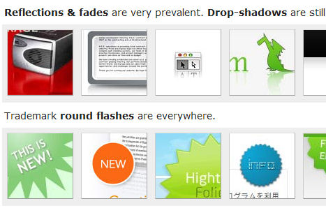
I found this link from BoingBoing. It basically goes through the elements of the more modern web pages out there. By modern, I really mean shiny and pretty. There’s some really good info in here.
The main idea is to use gradients to smooth things out and whitespace to be easy on the eyes. I think I might need to work a bit on the latter, myself.
I’ve been trying to make the design of my blog to look somewhat cooler. So far, the plasticy header and sidebar things are to my liking, but I think there’s probably more I could do. But first I need to get Photoshop! After that, I need some Photoshop skills…
In related news, my blog in Internet Explorer looks like utter crap. To fix this, get Firefox.
Leave a Comment